How to Read Stock Charts
Wouldn’t it be great if you could improve your investment returns by owning securities when prices are increasing and selling them before they crash? If you learn how to read stock charts, you might have a chance at doing so.
People take many different strategies for investing in stocks. I rely on a mix of investments in mutual funds, exchange-traded funds (ETFs), and individual stocks. When I buy the last of these, I rely primarily on fundamental analysis, as discussed by Milan Kovacevic in his post, “How to Start Investing in 2021: A Complete Guide.”
Milan suggests investing for the long term, a strategy I generally embrace. To do this, I use the strategies set forth by Peter Lynch, described in my review of his book “One Up on Wall Street,” and my ability to read financial statements.
Technical analysis or reading stock charts has always intrigued me. If I could use stock charts to help me sell a stock before the price falls too much or at least not buy it until it has hit its low price, it seems to me that the value of my portfolio would be higher than my current strategy of buying stocks and holding them forever.
In this post, I will teach you how to read stock charts. I then provide illustrations of how to interpret them using several commonly used technical analysis tools. To bring these techniques to life, I use a real-life example. The example is a stock I’ve owned for almost 30 years. I’ll close with a summary of the pros and cons of using stock market charts as part of your investing strategy.
Basic Stock Chart
There are two stock chart components - prices and volume.
Price Charts
Here is a price chart for Boeing for the first two and a half months of 2021.
The dates are on the x or horizontal axis moving from January 1, 2021, on the left, through March 12, 2021, on the right. The price is represented on the vertical- or y-axis. For each trading day, there is a box that often has whiskers above and below it. The color of the box tells you whether the stock price moved up (green) or down (red) that day.
On green days, the bottom of the box is the opening price. The opening price corresponds to the price of the first trade of the day. The top of the box is the closing price or the price of the last trade of the day.On red days, the bottom of the box is the closing price and the top of the box is the opening price. That is, the opening and closing prices switch places on red days as compared to green days. Of course, this switch makes sense when we think about the meaning of the colors. On a green day, the stock price went up, so the opening price is lower than the closing price. On a red day, the stock price went down, so the opening price is higher than the closing price.
Regardless of the color of the box, the whiskers correspond to the highest and lowest prices of the day. If the highest price is equal to the opening or closing price on a particular day, there will be no whisker sticking out of the top of the box. Similarly, if the lowest price is equal to the opening or closing price, there will be no whisker sticking out of the bottom of the box.
Volume Charts
Volume refers to the number of shares of the stock that were traded each day. The chart below shows the volume chart for Boeing for the same time period.The x-axis is the same in this chart as in the price chart.
The dates range from January 1, 2020, to March 12, 2021, going from left to right. The y-axis represents the number of Boeing shares traded each day. As with the price chart, the bars are color-coded. Green bars correspond to days on which the stock price increased; red bars, days the stock price decreased.
In these illustrations, I’ve used calendar days for the x-axes, so there are gaps on weekends. Many stock charts skip the weekends, so won’t have gaps.
Support and Resistance Levels
A simple tool used by technical analysts in deciding when to buy or sell a stock is the combination of support and resistance levels.
Support Levels
When a stock has been volatile or decreasing in price, it sometimes drops to approximately the same price two or more times and then starts increasing. That price is called a support level. The chart below shows Boeing’s adjusted stock prices from January 2002 through December 2004.
To make the illustrations throughout this post comparable, I have adjusted all of the prices and volumes for stock splits and dividends, as calculated by Yahoo Finance. To make the discussion easier to read, I will not include the word “adjusted” when referring to prices or volumes.
The blue line in March 2003 shows a support level. On March 12, 2003, Boeing’s stock price hit a low of $16.77. About three weeks later, on March 31, 2003, the low was $16.85, or almost the same as the low on March 12. In between, the price went up to a high of $19.27.In this case, the support level also corresponded to a turning point when the stock went from a decreasing trend to an increasing one. If you had been looking to purchase Boeing stock in this time frame and used this indicator, you would have benefited from the long run of increasing prices in the two subsequent years.
Resistance Levels
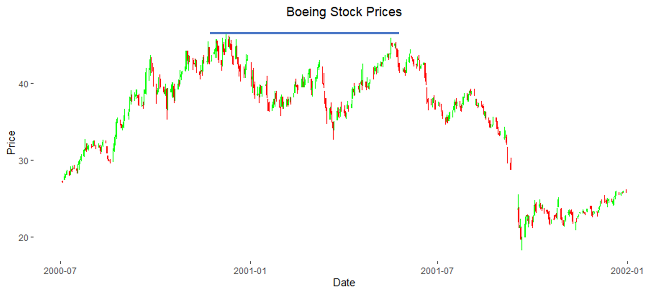
A resistance level is the opposite of a support level. Rather than looking at two low prices that are about the same, a resistance level is a price a stock hits more than once but doesn’t exceed. Boeing’s stock price hits a resistance level in late 2000 and early 2001 in the chart below.
On December 8, 2000, Boeing hit a high price of $46.35. Five months later, on May 22, 2001, Boeing’s high was $45.30. After that, it decreased significantly until late October 2001. Interestingly, anyone who had used this resistance level as a sell indicator would not have owned Boeing stock around September 11, 2001. They would have avoided the almost 50% decrease in the stock price. Of course, that timing would have been fortuitous as the presence of the resistance level early in 2001 was not predictive of the events of September 11.
For more information on support and resistance levels, I suggest this article from Investopedia.
Bollinger Bands
Bollinger bands are a refinement of support and resistance levels. They take into account recent trends and volatility in the stock price. The chart below adds Bollinger bands to the Boeing stock price chart from January 1, 2000, to early 2002.
Explanation of Bollinger Bands
This chart looks a lot like the one above that I used to illustrate resistance levels. In addition to the boxes with whiskers, there are two blue lines. The blue lines are centered around the average price for the previous 20 trading days. The lines themselves are drawn above and below that average price. The distance above and below the price is equal to two times the standard deviation of the price in the past 20 days.
Between January and July 2000, you can see that the spread between the bands is fairly stable. The stock price didn't take any relatively large jumps in either direction. Now compare the spread between the lines in this part of the chart with the spread from August to October 2001. The large price drop in August and September 2001 increased the standard deviation which, in turn, increased the spread between the lines.
Interpreting Bollinger Bands
There are many ways that Bollinger bands are used to identify trends in stock prices. Briefly, three of them are:
Double Bottom
Three Pushes to High
Classic M Top
The chart below illustrates these tools.
Double Bottom
The Double Bottom is similar to the support level discussed above. Instead of looking for a single price below which the price doesn’t fall, prices are compared to the bottom Bollinger band. This concept is illustrated by the three green arrows in the spring of 2000 in the chart above. Had the prices fallen much below the bottom Bollinger band, it would be indicated a further decline in the price.
Three Pushes to High
The three red arrows in late 2000 identify an example of Three Pushes to High. This concept is similar to the resistance level discussed above. It differs, though, in that technical analysts look for three touches instead of two. Also, the price is compared to the top Bollinger band instead of a constant level. Three Pushes to High without the price exceeding the top Bollinger band can be an indication that the price might go down. Three Pushes to High, with the third one continuing above the line, indicates optimism about the stock price.
Classic M Top
The red circle in June 2001 identifies a Classic M Top. A Classic M Top is even closer to the resistance level concept than Three Pushes to High in that it looks for the price to touch or approach the upper Bollinger bands only twice. Note that, as in this case, the second peak does not need to reach the top Bollinger band. As with the resistance level, a Classic M Top is used as an indicator that the stock price will, at a minimum, not increase by much in the near term and may decrease.
Other Bollinger Band Tools
For more information on these tools and others, I suggest starting with this article from Schwab.
Moving Averages
Some technical analysts look at how the stock price has moved compared to averages of its recent prices. I interviewed a technical analyst in this post who uses the following tests to inform his buy and sell decisions:
Buy signals are identified by the stock price line going up through the line corresponding to the average of the prices for the previous 180 days. The average of a series of numbers is known as a simple moving average and, in this case, is often referenced as SMA 180.
Sell signals are identified by the average of the prices for the previous nine days falls below the average for the previous 180 days. That is, the SMA 9 line crosses below the SMA 180 line.
Reading the Chart
The chart below shows the Boeing stock price and the nine- and 180-day moving averages.
The black line shows the closing stock price on each day from January 1, 2002, through the middle of 2006. The pink line is the average of the closing price for the previous nine days. As you can see, it follows the closing price fairly closely. The blue line is the average of the closing price for the previous 180 days. It follows the trends of the closing prices much more slowly. And, because there are more values in the average, is much smoother.
Interpreting the Chart
This stock chart shows the same information with four circles added.
The two green circles show where the stock price (black line) goes up through the SMA 180 (blue) line. These crossover points are buy signals.
The two red circles show where the SMA 9 (pink) line crosses below the SMA 180 (blue) line. These crossover points are sell signals. If we assume that it takes you until the day after the crossovers to initiate your transactions and you do so at the opening price, you would have made the following transactions during this period:
Buy at $29.13 on 4/30/02
Sell at $27.30 on 7/18/02 for a $1.83 per share loss
Buy at $20.73 on 5/29/03
Sell at $55.42 on 8/23/06 for a $34.69 per share gain
Volume Indicators
So far, all of the technical analysis tools I’ve discussed have focused on price movements. Some analysts also look at how the volume changes in conjunction with prices. Here are two components of volume that some technical analysts consider.
Relative volume at turning points.
The trend in volume as prices continue in one direction or the other.
I’ll again use Boeing’s stock charts, this time from 2006 through 2010, to illustrate these points.
High Volume at Turning Point
Boeing’s stock price hit a turning point in late 2008, at about $80. When it turned from its upward trend to its downward trend, the volume was very high relative to the average daily volume as indicated by the very tall red bar on the volume chart. This relatively high volume at the turning point is often used as an indicator that the trend in prices will turn. This indicator can happen in either direction. That is, a green bar that stands out as being really tall can be indicative of a turn from decreasing to increasing stock prices.
Contrary Trends
The second indicator is the trend in volume when the stock prices are going in one direction or the other. In this example, the stock price decreases fairly steadily from late 2007 to late 2008. I’ve marked that trend with a red downward arrow on the stock price portion of the chart. At the same time, the volume is generally increasing. I’ve added a red arrow on the volume portion of the chart. An increase in volume, when the stock price is moving consistently in one direction or the other, is often used as an indicator that the stock price will continue to move in the same direction. In this example, you can see that the volume was much lower starting in late 2008 at the same time that the stock price flattened. For more details about this second indicator, you might check this article from Schwab.
Historical Tests
To help understand the pros and cons of these techniques, I’ve tested them on Boeing’s stock prices during two periods of particular price disruptions – July 21 through September 24, 2001, and February 13 through May 15, 2020. The chart below shows the Boeing stock prices since 1995.
These two disruptions, shown in the blue circles, are quite visible with the benefit of hindsight. The first time period doesn’t look as dramatic because of the significant rise in the stock price since 2001. However, the stock price decreased by 49% in a short period of time in 2001, not quite as large as the decrease in early 2020 of 67%.
As noted above, I am a long-term fundamental investor. However, I am always interested in learning about techniques that might help me avoid significant decreases in the value of individual stocks in my portfolio. To evaluate these techniques, I’ll assume I bought 100 shares of Boeing stock at the adjusted opening price of $10.62 on January 4, 1992. Those shares would have cost me $1,062. If I had done that and still held the same shares on March 12, 2021, they would be worth $25,386.Let’s look at whether any of the price-based techniques discussed above would have helped increase the value of my Boeing position. I did not use the volume indicator in this comparison, as it tends to be better used to confirm trends rather than to identify turning points.
Support and Resistance Levels
The chart below shows Boeing’s stock prices around the large price drop in 2001.
As indicated by the blue line, this stock chart shows a pretty clear resistance level at the top in late 2000 and early 2001. If I assume it took me 5 days to recognize the Double Top, I would have sold the stock at $336. There was no Double Bottom, though, so I wouldn’t have repurchased it.
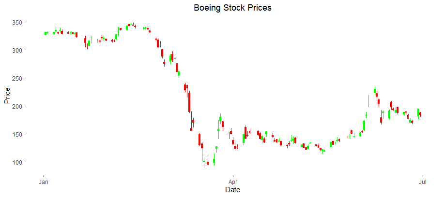
The chart below shows Boeing’s stock prices around the time of the 2020 decrease.
In this case, there isn’t a clear support or resistance level, so I wouldn’t have made any transactions. If I had used this approach, I would have sold my 100 shares at $336 in 2001 and had $33,600 to invest elsewhere. Even if I hadn't reinvested, I would have had more money using this technique than the buy-and-hold strategy I used.
As an aside, I have used support and resistance levels as a trading tool in a different way. Sometimes a stock price goes up and down between a support level and a resistance level. When I had time and money to risk, I took advantage of this pattern with two different stocks. In both cases, the stock price moved up and down within a range of $10 (e.g., between $80 and $90) several times over the course of six months. Every time the price got to the top of the range, I’d sell it. When it got to the bottom of the range, I’d buy the stock. In each case, I was able to buy and sell the stocks three or four times, giving me a $10 per share gain each round trip.
Bollinger Bands
The chart below shows Boeing’s stock price, including the Bollinger bands, around the large price drop in 2001.
The Bollinger bands indicated sales in late 2000, early in 2001, in late May 2001, and then again in August 2001, with buy indicators in between. Because we are focusing on the large price drop from July 21 through September 24, I’ll just focus on the bands around that time period. The Bollinger bands indicated a sell around May 31 when the price was about $42 a share, as indicated by the first orange circle. They then indicated a buy at the low on September 24. If I assume it took me 5 days to recognize that low, I would have bought the stock at about $22.
The chart below shows the corresponding information around the 2020 price decrease.
In this example, the stock price approached the Bollinger band on February 13. Again assuming it took five days to recognize this point, I would have sold the stock at about $335. Using the same logic, I would have purchased it about five days after the low at a price of about $130.If I had made these trades, the $1,062 with which I started in 1990 would have had a value of $132,000 in early 2021. This amount is only a very rough approximation, though, as I ignored all but these two buy and sell signals.
Simple Moving Averages (SMA)
The chart below shows Boeing’s stock price, including the SMA 9 and SMA 180 lines, around the 2001 price decrease.
The SMA lines indicate a sale on June 25, 2001 (when the pink line crossed below the blue line and circled in red). If I sold the stock the next day, I would have gotten about $37.50 per share. Because the crossing of the two lines is much easier to identify, I assumed I would make the trade the next day rather than waiting five days. The next buy signal came on February 22, 2002 (when the black line crossed above the blue line and circled in green). If I bought the stock the next day, I would have paid about $29.75 per share.
The chart below shows the corresponding information around the large price drop in 2020.
The SMA lines indicate a sale on December 9, 2019. If I sold the stock the next day, I would have gotten about $347 per share. The next buy signal came on November 9, 2020. If I bought the stock the next day, I would have paid about $185 per share.If I had made these trades, the $1,062 with which I started in 1990 would have had a value of $56,000 in early 2021.
Comparison
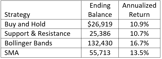
The table below compares my gains if I had used each of four strategies for dealing with the large price drops in 2001 and 2020.
As indicated above, these estimates only focus on the two time periods during which the price dropped significantly. As such, the ending balances for the strategies other than Buy and Hold would have been different if I had followed the buy and sell indicators consistently. Nonetheless, this comparison illustrates the benefits of being able to identify turning points in the price of a stock.
Closing Thoughts
Knowing how to read stock charts can provide insights that might help you avoid owning a stock when the price drops significantly. That, in turn, can increase the total return on your portfolio. However, as with any investing strategy, technical analysis can’t predict the future price of a stock or predict future price movements. Specific drawbacks to relying solely on technical analysis for your buy and sell decisions include the following.
You need to look at the stock charts frequently, at least once a day, to avoid having the stock price change dramatically before you execute your trades.
You will likely have many more trades in your portfolio. For example, there were several buy and sell indicators that I ignored on the SMA and Bollinger Band stock charts from 2001 and 2020, along with many more during time periods not included in these charts.
The buy and sell indicators on your stock charts may not work in every situation. As you may recall, there was no support level after the 2001 Boeing price drop and no support or resistance level around the 2020 price decrease. And, the support-and-resistance-level approach performed worse than the buy-and-hold strategy in my comparison.
If you hold your stocks in a taxable account, you will need to pay capital gains tax every time you sell a stock at a profit. These taxes will reduce your total return, possibly enough to offset the benefits of avoiding price decreases.
Very few people have made money by timing the market or individual stock prices in the long term. Using technical analysis as the sole basis for your trading decisions is essentially a form of timing the market.
Technical analysis can’t anticipate world events, such as the events of September 11, 2001, or the COVID-19 pandemic in 2020.
As such, you’ll want to consider these risks if you decide to incorporate your new knowledge of how to read stock charts into your trading strategy.
This article originally appeared on Your Money Geek and has been republished with permission.


