Picking Stocks Using Pictures
Technical analysts select companies for their portfolios based on patterns in stock prices. That is, it allows them to enhance their process of picking stocks by using pictures. This approach is very different from some of the others I’ve discussed, as buy and sell decisions are based in large part on these patterns and less on the financial fundamentals of the company. Every technical analyst has a favorite set of graphs he or she likes to review and their own thresholds that determine when to buy or sell a particular stock.
I’ve done just a little trading based on technical analysis, so asked Rick Lage, a family friend who has much more experience with this approach, to help me out. In this post, I will provide some background on Rick and provide explanations of the graphs he uses. I’ll also provide some insights on who I think is best suited for this type of trading. If you are interested in more information about technical analysis, check out this post I wrote with more examples.
Rick’s Story
Rick’s Background
“I was first introduced to the stock market in a Junior High School math class. I made my first trade with a stockbroker about 6 years after graduating from High School.
My interest in the stock market never faded. I was always focused on this platform to make money. Unfortunately losing money was a regular occurrence for many years in the beginning, with not many gains to be proud of.
My interest peaked in 1999 when I attended my first stock trading event in Las Vegas, known as the TradersExpo[1]. TradersExpo provides a wealth of information available for the beginner to the pro, including hardware, trading software, classroom instruction and more.
I personally have never been a day trader. Swing trading is more my definition. I do touch base with my stock watch list daily. It’s always managed and checking my technical indicators is a must.”
Rick’s Goals
“I stock trade for the challenge; not so much for the fun or success. If there is success the fun will follow. There will be losses. No doubt. But you learn how to manage those losses. You have no choice. Technical trading is my science.”
Rick’s Advice to New Traders
Rick says, “I have tried hard to never complicate the trade. There are many technical indicators, so don’t get overwhelmed. I pick stocks that have the momentum. Pick your favorite few indicators and go with those.”
Rick’s Tools
Rick’s favorite indicators are
Simple Moving Averages using 9 and 180 days (SMA 9 and SMA 180)
Price and Volume Charts
Relative Strength Index (RSI)
Moving Average Convergence Divergence (MACD)
Heikin-Ashi bar chart
I will provide brief introductions to each of these indicators, illustrating each with two stocks – Apple and Shopify. A graph of Apple’s stock prices from January 1, 2018 through mid-May 2020 is shown below. It had some ups and downs in price in 2018 and 2019, followed by a significant decrease and recovery so far in 2020.

Shopify had a steadier increase in 2018 and 2019, but much more volatility so far in 2020, as illustrated in the graph below.

Simple Moving Averages (SMA 180 and 9)
In this context, a simple moving average (SMA) is the average of the closing prices for the past n days, where n is specified by the person making the chart. In Rick’s case, he looks at the 180-day simple moving average and the 9-day simple moving average. For the former, he takes the average of the closing prices for the previous 180 days; for the latter, the average of the closing prices for the previous 9 days.
SMA Charts
Technical analysts add their favorite SMA lines to the chart of the stock’s price. For illustration, I’ve added the SMA 180 and SMA 9 lines to the Shopify and Apple stock price charts below.


SMA Indicators
Technical analysts then look at the crossing points on the chart to provide buy and sell indications. For example, a technical analyst might look at when the closing price line (black in these charts) goes up through the SMA 180 line (blue in these charts) and call it a buy signal or an indication of a time to buy a stock.
You can see an example of a buy signal, using this method, for Shopify around May 1, 2019, as indicated by the green circle. The buy signals for Apple are much more frequent using this criterion, two of which are indicated with green circles.
Similarly, a technical analyst might look at when the SMA 9 line (yellow/orange in these charts) goes down through the SMA 180 line and call it a sell signal. Using this criterion, there was a clear sell signal for Apple in early November 2018, as indicated by the red circle.
Every technical analyst has his or her favorite time periods for SMA lines. In addition, each technical analyst selects his or her own criteria for buy and sell signals based on those SMA lines. The shorter the time period associated with the SMA, the more often buy and sell transactions will be indicated. When I use SMA graphs to inform my buy and sell decisions, I use fairly long time periods as I am a long-term investor. By comparison, some people trade in and out of stocks several times a day, so use very short time periods, such as minutes or hours.
Price and Volume
A price and volume chart shows plots of both the price of a stock and its volume on a daily basis, color-coded to indicate whether the stock price went up or down each day. The graph below is a price and volume chart for Shopify.

The upper chart has rectangles (called boxes), sometimes with lines sticking out of them (called whiskers). The combination of the boxes and whiskers is often called a candle. There is one candle for each trading day.
Price & Volume Indicators
A red box indicates that the price was lower at the end of the day than at the end of the previous day; a green box, higher. Green boxes can be interpreted as follows:
The bottom of the box is the opening price.
The top of the box is the closing price.
The bottom of any whisker sticking down from the box is the lowest price on that day. If there is no downward whisker, the lowest daily price and the opening price were the same.
The top of any whisker sticking up from the box is the highest price on that day. If there is no upward whisker, the highest daily price and the closing price were the same.
Red boxes can be similarly interpreted, but the opening price is the top of the box and the closing price is the bottom of the box.
The lower section of the chart shows the number of shares traded each day. If the bar is green, the stock price went up that day, while red corresponds to down.Technical analysts use these charts to identify trends. A really tall green bar in the lower section green is an indication that a lot of people think the stock will go up so are buying. Many technical analysts consider this a buy signal. Similarly, a really tall red bar is considered by some to be a sell signal. My sense is that you need to be very quick to respond using this type of strategy, as you don’t want to sell a stock after everyone has already sold it and the price has dropped or buy it after the price has increased.
Relative Strength Index (RSI)
The Relative Strength Index (RSI) is intended to measure whether a company’s stock is in an over-bought or over-sold position. If it is over-sold, it is a buy signal; if over-bought, a sell signal. The RSI is one of a broad class of measures called oscillators, all of which are intended to evaluate whether the market is over-bought or over-sold.
The RSI is determined based on a moving average of recent gains and the moving average of recent losses. The value of the RSI is scaled so it always falls between 0 and 100.The RSI was developed by J. Welles Wilder. He considers the market over-bought when RSI is greater than 70 and oversold when it is below 30. There are many other ways in which the RSI chart can be used to identify trends and inform trading decisions that are outside the scope of this post.
The chart below shows the RSI for Apple (blue) and Shopify (orange).

The red horizontal line corresponds to RSI equal 70, Wilder’s over-bought signal. The green line is Wilder’s over-sold signal at RSI equals 30.
In this chart, there are several times when both stocks were over-bought. That is, the RSI for both stocks goes above the red line. Apple was considered slightly over-sold a few times, when the blue line crossed below the green line. By comparison, Shopify’s RSI came close to indicating that it was over-sold a few times, but never went below the green line.
Moving Average Convergence Divergence
The Moving Average Convergence Divergence indicator (MACD) is similar to the Simple Moving Average indicator discussed above. However, it uses an exponentially weighted moving average (EMA) instead of a simple moving average. A simple moving average gives the same weight to each observation. An exponentially weighted moving average gives more weight to more recent observations. MACD can use any period – minutes, hours, days, etc. For this illustration, I will set the period equal to a day. If you are trading more often, you’ll want to replace “day” in the explanation below with “hour” or “minute.”
The MACD was defined by its designer as the 12-day moving average (EMA 12) minus the 26-day moving average (EMA 26). MACD is compared to its own 9-day moving average to determine buy and sell signals. As with the simple moving average, the MACD crossing its 9-day moving average in the upward direction is a buy signal. When MACD falls below its 9-day moving average, it is a sell signal.
MACD Charts
The graph below shows Shopify’s daily closing prices along with the EMA 12 and EMA 26 lines in orange and green, respectively, starting on February 1, 2020.

This next chart shows the corresponding values of MACD (black) and its 9-day moving average (green).

If you compare the two graphs, you can see that MACD goes below the 0 line on the second chart on April 1, 2020. This transition is consistent with the orange line crossing above the green line on the first chart on the same date.
MACD Indicators
When Shopify’s MACD is bullish, its MACD is greater than its 9-day moving average or the black line is above the green line in the second chart above. This situation has been seen several times in the past few months – for short periods starting on February 11, March 23 and May 4 and a longer period starting on April 9.
The Apple MACD chart, shown below, has gone back and forth between bullish and bearish (black line below the green line) much more often in the past few months.

It sometimes changes from bearish to bullish and back again on almost a daily basis.The “convergence” and “divergence” part of MACD’s name refers to how the MACD behaves relative to the price. The relationship is somewhat complicated, so I suggest you refer to one of the sources I mention below if you are interested in this feature of MACD charts.
Heikin-Ashi bar chart
Also known as a Heikin-Ashi candlestick chart, the Heikin-Ashi bar chart is similar to the price part of the Price-Volume chart described above. However, instead of using the actual high, low, open and close prices, all four of the points on the candle are calculated in a different manner. The purpose of the adjustments is to make a chart that makes identifying trends easier. I refer you to one of the resources below to learn the details of how these values are adjusted.
Heikin-Ashi Charts
The charts below show the Heikin-Ashi charts for Shopify and Apple for the past six months.


As mentioned, they look a lot like Price charts, except the boxes corresponding to the adjusted open and close and the whiskers corresponding to the adjusted high and low. The boxes are colored green when the adjusted close is higher than the previous adjusted close and red otherwise.
Heikin-Ashi Indicators
Here are some of the indicators people review when using Heikin-Ashi charts:
Longer boxes are indicative of trends. In the charts above, you can see that the Apple chart tends to have longer boxes than the Shopify chart.
When there is no whisker on one end of the box, the trend is even stronger. For example, neither the Apple nor Shopify charts have upward whiskers on the red boxes from mid-February to mid-March 2020. This time period corresponds to the time period highlighted by the red arrow on the chart below when both stocks’ prices were going down.

Similarly, almost none of the green bars in the last month of the Heishen Ashi chart have downward whiskers, corresponding to the time period in the price chart indicated by the green arrow.
Time periods when the boxes are short, have both whiskers and change color often are indicators of changes. For example, the Apple Heikin-Ashi chart from mid-January to mid-February shows several bars of alternating colors. Apple’s price changed from an upward trend to a downward trend in this period, as shown in the purple circle in the chart below. Identifying turning points is very important in deciding when to buy and sell stocks.

Who Can Use Technical Analysis
Technical analysis isn’t for everyone. It requires people who (a) have the ability to focus on markets fairly closely every day in the case of swing traders or all day in the case of day traders, (b) are happy with growing their portfolio with a large number of small “wins,” and (c) have a solid understanding of the charts being used.
Time Commitment
Unlike many other investment strategies, many day traders and swing traders do not consider a company’s financial fundamentals in their buy decisions. Instead, they monitor the patterns in their charts. Without the comfort of believing that the companies they own have sound fundamentals, it is important that they follow their charts consistently so they can quickly sell any positions that are not meeting expectations.
Lots of Small Wins
In my post on financial fundamentals, I talk about Peter Lynch’s concept of a 10-bagger – a stock whose value is at least 10 times what you paid for it. In that paradigm, the goal is to attain better-than-market-average returns by getting average returns on most of the positions in your portfolio and big gains on one or two positions.
By comparison, the goal of day traders and swing traders is to make a very small amount of money on every trade, but to make lots and lots of those trades. If you earn 0.1% on average on every trading day, it compounds to just over 20% a year!For many of us, buying and selling with gains of less than 0.1% per security seems really small and might not seem worthwhile. As such, you need to be willing to be happy with lots of little wins rather than a 10-bagger if you want to be a day trader or swing trader.
Understand the Charts
One of the requirements of using technical analysis is to make sure you understand how to interpret the charts correctly. For example, Southwest Airlines (ticker: LUV) has done very poorly recently from the impact of COVID-19. The plot below shows its closing stock price from February 15, 2020 through May 20, 2020.

As can be seen, the last stock price on the graph (about $29) is almost exactly half of the stock price in mid-February (peaked at $58.54). As such, while it has had a few days on which the price increased, the overall trend has been down.
The RSI chart is shown below. Remember that an RSI value of less than 30 is an indication that it might be time to buy the stock.
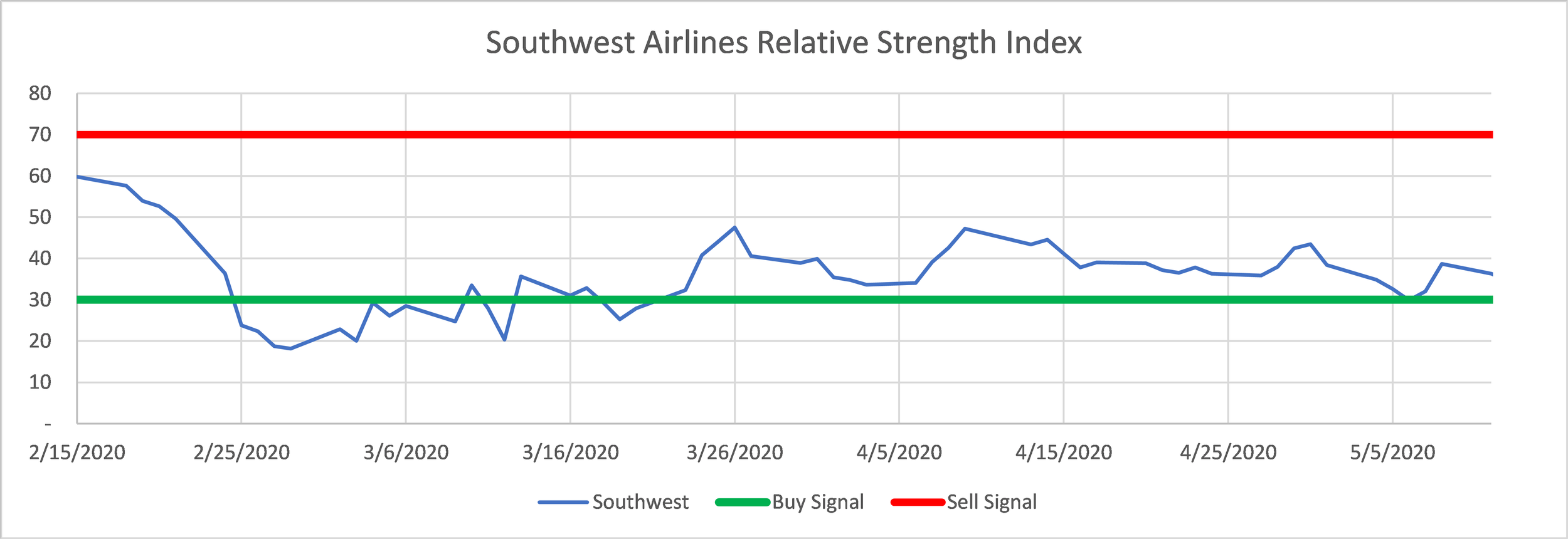
Southwest Airlines Relative Strength Index chart from Feb 15, 2020 to May 20, 2020.
In this example, there was a buy signal when the RSI crossed below the green line (30) on February 25. The closing stock price on that day was $49.66. If you had bought the stock on that date, you would have lost 41% in the subsequent three months as the stock was at $29 on May 20, 2020.
As you can see, interpreting charts takes time and expertise. If you are willing to invest the time to learn all of the nuances of each type of chart and monitor your positions, technical analysis might be the right investing strategy for you.
There’s a lot more to know about each of these indicators than I've provided in this post.
How I Use Technical Analysis
I primarily rely on analysis of the underlying fundamentals of a company when I purchase individual stocks. Once I make the decision to buy a stock, I look at the charts to evaluate whether the timing is good for a purchase. If the consensus of the charts I review indicates that the position is over-bought (i.e., price is too high), I will wait to see if the price decreases before buying.
In addition, I use technical analysis in my Roth IRA, where there are no capital gains taxes on trades so more frequent trading isn’t adversely impacted. I follow a large handful of industry ETFs using technical analysis and buy and sell them as each one appears to be doing well. Because I am trading in industry exchange-traded funds (ETFs) and not individual stocks, I feel comfortable looking at my positions once a week. My thought is that industries aren’t likely to experience sudden weaknesses not seen throughout the market in shorter time frames.
When I pay sufficient attention to the positions in my Roth IRA, I tend to get about or slightly above market-average performance. However, when I don’t look at my positions and re-balance regularly, I find that my performance suffers which just confirms my first point in the previous section that using technical analysis requires time and diligence.
[1] There are now TradersExpo events held regularly in many cities (subject to change by the coronavirus).